Text over images or videos is common on websites, and when not done right, it can make the text hard to read and cause accessibility and usability issues. Designers might not catch these problems early on because they use ideal settings to test designs.
The real problems show up when we change the browser size or when new images and videos are added. This can lead to bad contrast, text that overlaps, and other issues with how clear things are.
In this article, we'll point out 3 common problems with using text over media and offer ways to fix them. Our goal is to make sure that the design works well in real use, without messing up the process of adding new content, and that users find it easy to use.
Poor contrast
Problems with reading text can happen especially when the text and background have similar colors, or if the background has a busy design that distracts from the text.
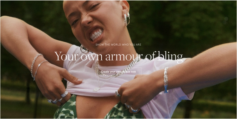
Illegible text on about.puma.com/en/this-is-pumaIllegible small text on eu.puma.com/de/de/homeWhite text on white background on camillebrinch.com
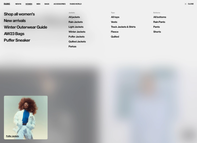
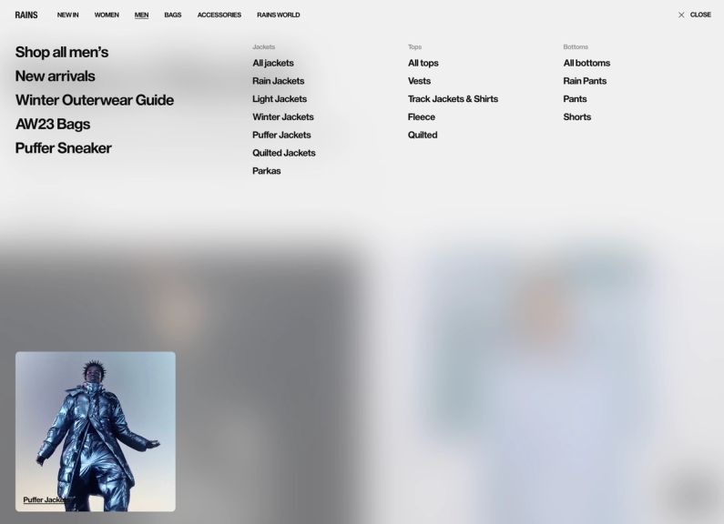
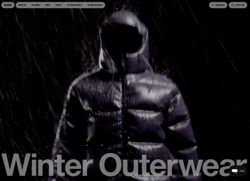
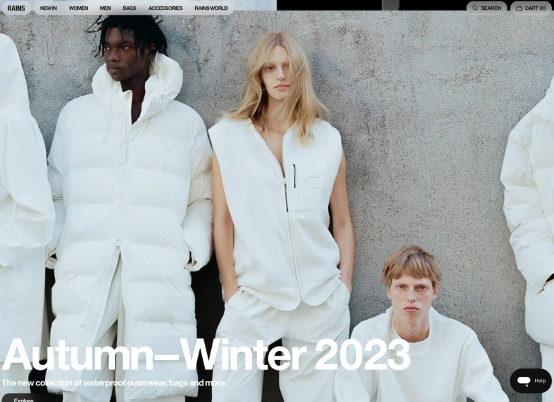
On RAINS' menu, the text is legible in the bottom left image below.
Legible text on RAINS www.rains.com
However, the moment the image is replaced, we end up with partially illegible text.
Partially illegible text on RAINS www.rains.com
The same issue happens with videos: the text is easy to read in some frames but not in others.
Somehow legible text on rolex.comIllegible text on rolex.com
Overlapping text
Text on top of other text is hard, if not impossible, to read.
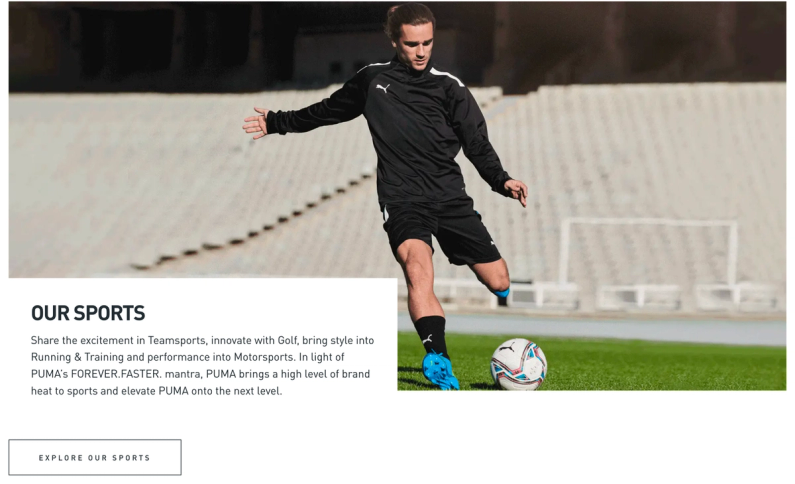
Overlapping text on about.puma.com/en
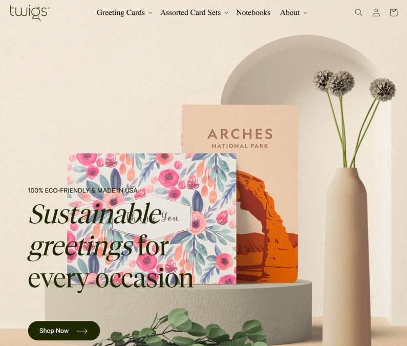
On desktop the text on Twigs is well placed, but when we resize the screen it overlaps with text.
Properly placed text on twigspaper.comText overlap on twigspaper.com (tablet)
This issue can also occur in videos that include text.
Motion sickness
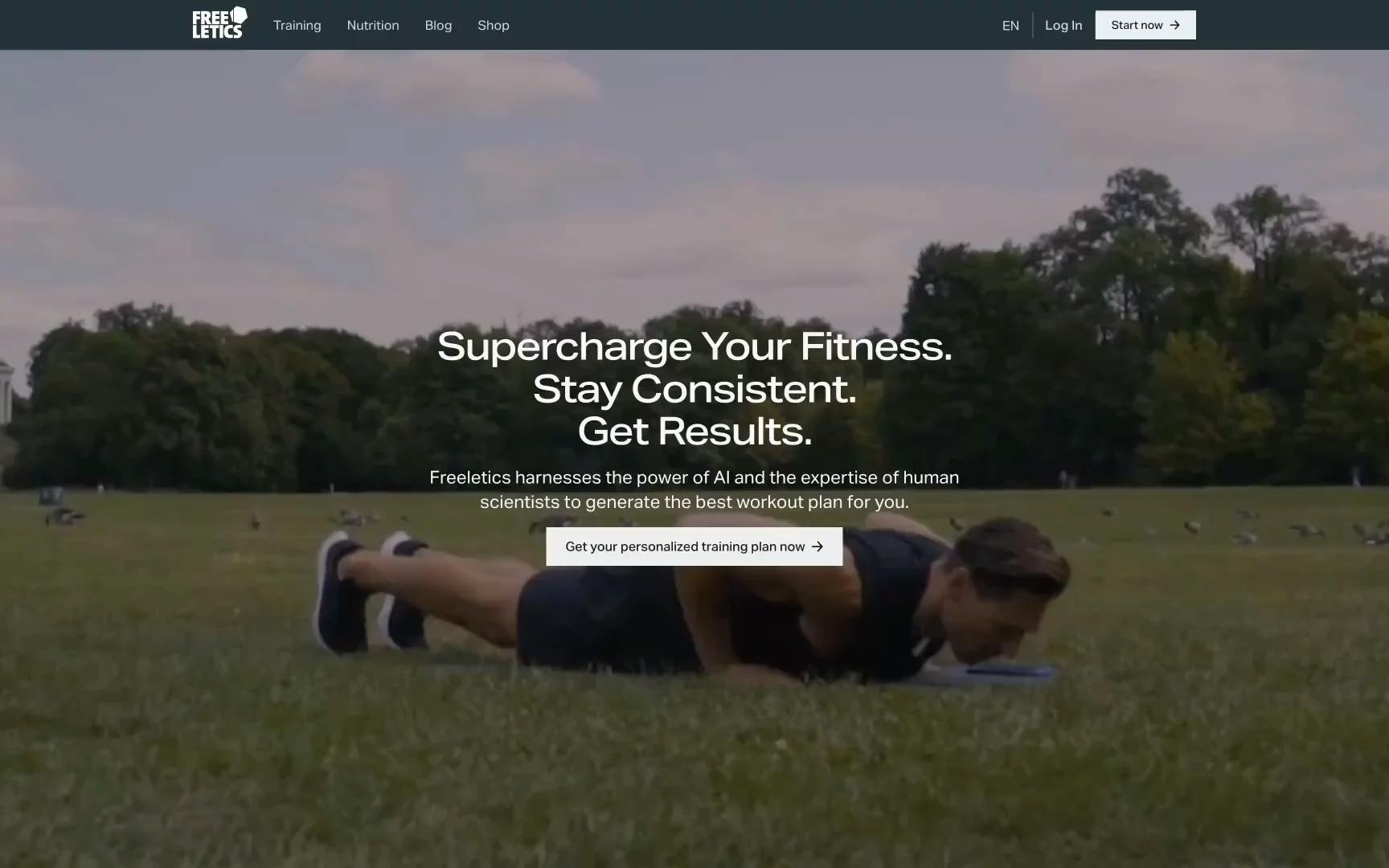
When a video has a lot of action, like on the Freeletics homepage, it can be hard for some users to concentrate on the text.
Text on video on freeletics.com
Boxed text
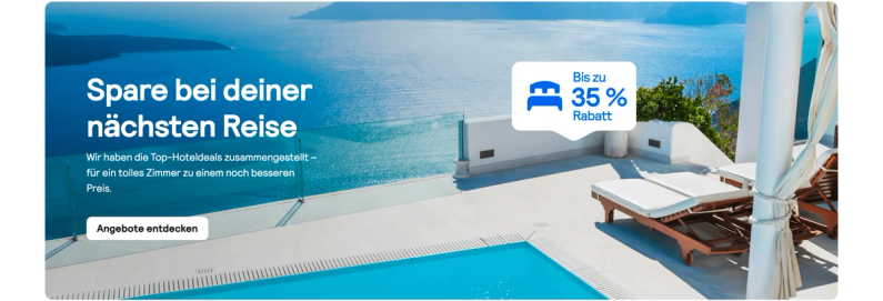
To make text stand out from the background, we can put the text and buttons in a box. This box can be placed anywhere on the image or video, or in a corner.
Boxed text on onpurposeevents.coBoxed text on about.puma.com/en/this-is-pumaBoxed text on cocofloss.com
Huge fonts, few words
Big fonts are usually easier to read, but they can still be hard to see if they're the same color as the background.
rains.com example 1rains.com example 2
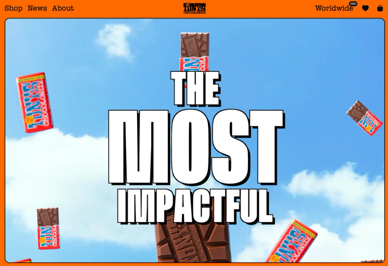
Adding a text shadow can help make the text easier to read, even if the background color is similar, but this only works with some styles.
tonyschocolonely.tinloof.com
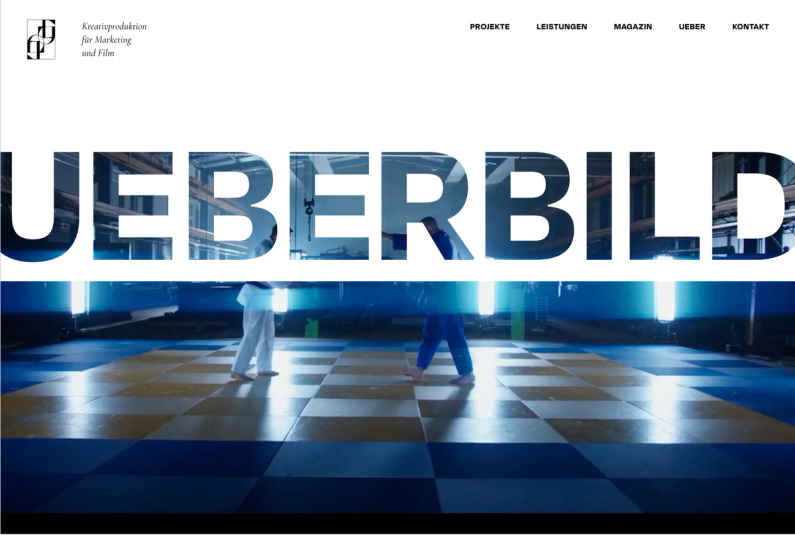
Mask
This approach is better for short text, as it may get hard to read if the sentence is too long.
ueberbild.de
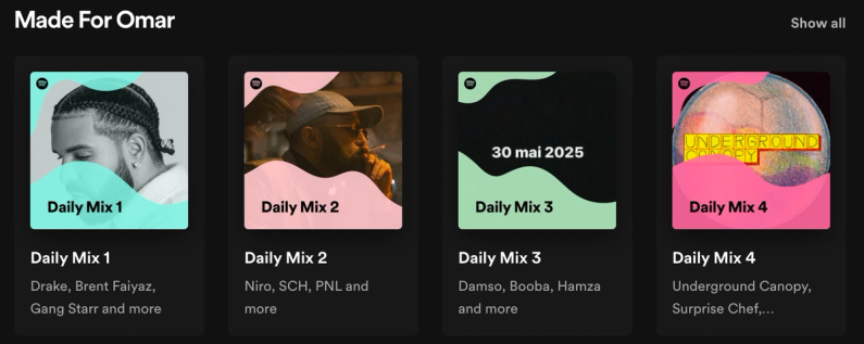
Text highlight
We can highlight just the text, without affecting the media background behind it.
spotify.com logged in
Text in assets
Depending on the situation, adding the text directly in the assets might work as a band-aid solution, but a more thought-out solution may be needed for the long term.
Example below for Skyscanner, where assets have parts of the text as part of the asset. It would be a tedious task to create all these assets, considering 30+ languages are supported.
Text in asset skyscaner.comText in asset skyscanner.com 2
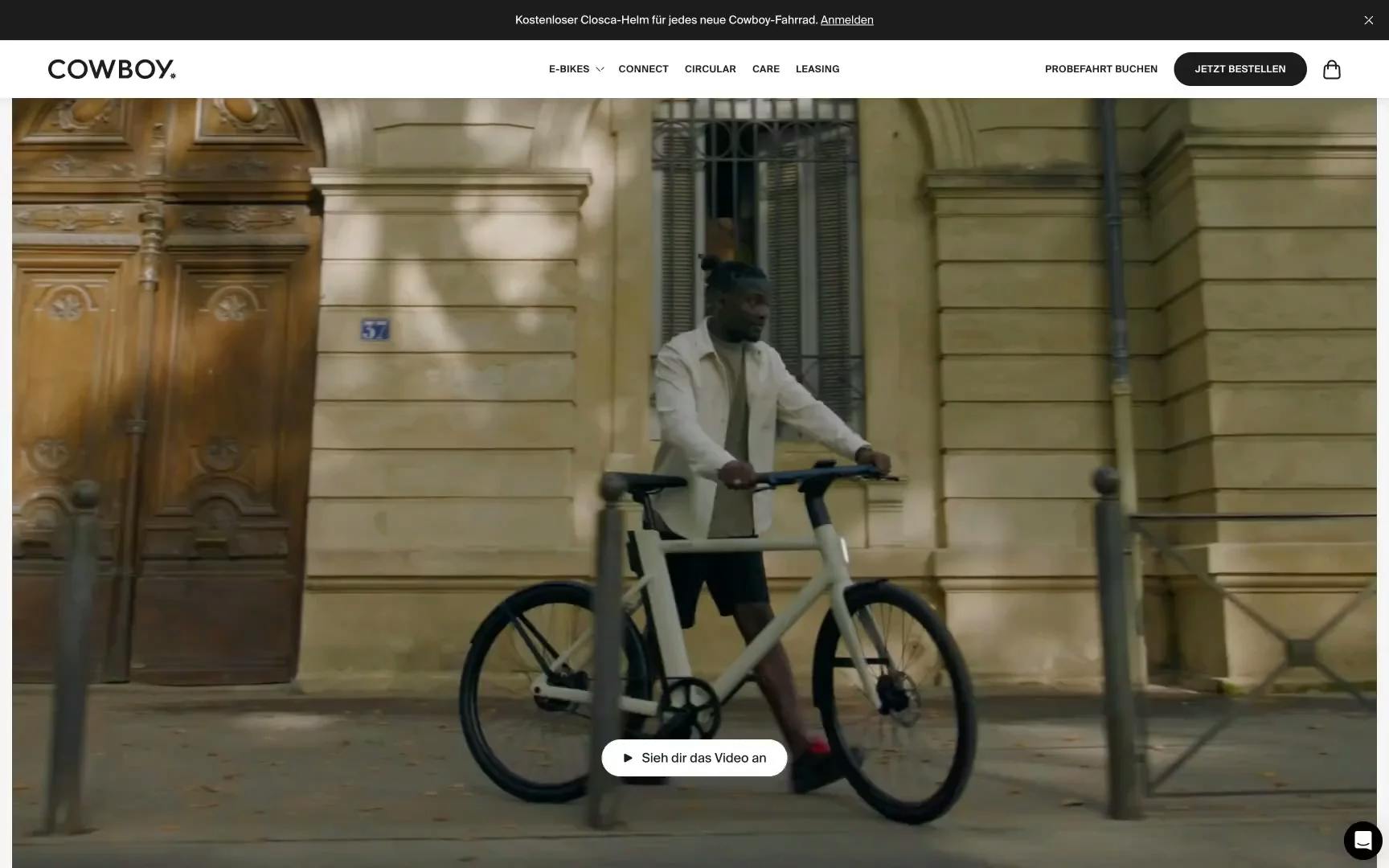
Using the same logic, this could be a problem with videos too. For example, the German website uses the word "Ride." While this might be okay in Europe, using a German word could be more fitting.
If the company, COWBOY, expands to other markets, they would need to update the video to match the new languages.
cowboy.com
Full overlay
It can be a solution, but stakeholders may say that darkening the image too much is a problem, especially if the image is a key feature to highlight.
Here is a tool to find the optimal overlay finder. However, considering that content managers are free to upload any image or video in the CMS, it's best to stress test it with varied images and videos.
netflix.com logged out
Fade / Partial overlay
This method can be more refined than using a dark overlay and works best when the text is at the bottom. It's effective without dimming the entire image.
How Spotify makes text on images more readable: a CSS linear-gradient overlay. More common these days, but still an effective technique for better color contrast. pic.twitter.com/tZDlwLRx3G
Sometimes we make a problem out of something that shouldn’t be, and keep digging deeper into “solving” it. Instead, we could simple scratch the so-called problem, and use a totally different layout.
Using text over images or videos can be more challenging than it initially appears, so it's important to consider the tips provided above.
If those solutions aren't effective, it might be more practical to switch to a different layout rather than investing too much time in something that simply isn't working.
At Tinloof, we aim for seamless and efficient design handoffs, drawing from our experience completing dozens of projects.
Our ultimate goal is a "0 questions asked" handoff, akin...
If you're a frontend developer, you are probably spending as much time on VS Code as on Figma.
This quick read highlights some of the goodies that I personally use to speed up my workflow....
This series of articles is made out of two parts:
In this first article, we provide a comprehensive guide to designing an intuitive and universally accessible carousel for any web...