In this article, we will create a Progressive Web Application! Don’t worry, we won’t make another todo list. Instead, we will build a fun game that satisfies Google’s checklist for building a PWA.
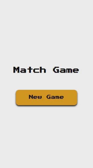
Final result
You can play it here and check the final source code on Github.
1- Requirements: what do we want to achieve?
Let’s first understand what we want to achieve.
Here are the game’s functional requirements:
There is a 4 x 3 (4 rows, 3 columns) grid of cards.
By default, each card shows its back and hides a certain emoji.
There are in total 6 unique emojis. Each emoji is duplicated, making the total number of emojis 12.
The player can flip any card that has not been matched yet, showing the emoji behind it.
If the player flips their second card and it does not match the previously flipped one (i.e. they don’t have the same emoji), then both cards are flipped back to their initial position.
If the player flips their second card and it matches the previously flipped one, then both cards are matched and the player’s score is incremented.
The maximum score is 6 (1 point per matched pair). Once the player reaches the maximum score, the game ends with a displayed winning message.
Our game should also satisfy the following items to be considered a PWA:
The game is served over HTTPS.
All pages are responsive on tablets and mobile devices.
The game can be added to the home screen of the user’s device and look like a native app.
Offline Loading: The game should be functional offline
Fast first load.
Page transitions don’t feel like they block on the network.
Each page has a URL.
2- Designing our pages
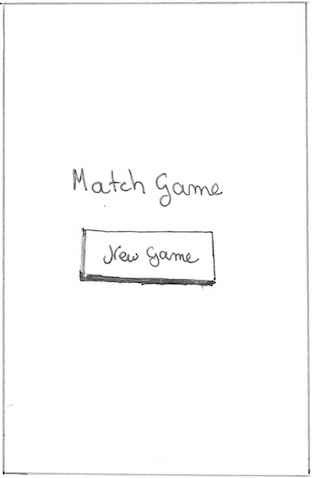
Before we jump into code, let’s grab a pen and paper and draw what our pages will look like.
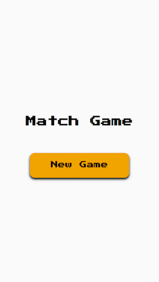
To keep it simple, the home page will just have the game’s title and a button to start a new game:
Homepage
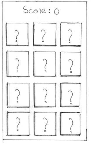
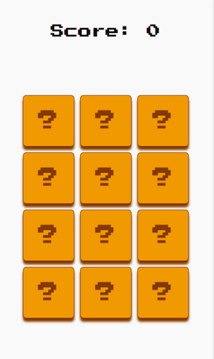
The game page is basically a grid of cards and the score of the player above it:
Game Page
The cards can be either in the default, flipped or matched state:
DefaultFlippedMatched
3- Bootstrapping the application with preact-cli
Now that we have our requirements in place, let’s kick off our application development. We can quickly bootstrap our application using preact-cli.
First, let’s install it globally:
npm i -g preact-cli
Then let’s use preact-cli to bootstrap our match-game:
preact create default match-game
The generated source code has the following structure:
└── src
├── assets
├── components
├── index.js
├── manifest.json
├── routes
└── style
assets will contain our assets (favicon and other icons)
components will have our preact components including the main App component
index.js is the entry point to our application
manifetst.json : will provide information about the icons of our game in Android devices.
routes will contain our routes.
style will have global CSS for the application.
Let’s empty both the components and routes directories since we will build our components and routes from scratch.
4- Setting up the routes
Our game will have 3 routes:
/ Home route: points to the homepage containing the game’s title and a button to start playing.
/game Game route: points to the game page containing the score and the grid of cards to be flipped.
/win Win route: points to the winning page showing a message to congratulate the user after winning.
Let’s first create these routes:
Home route:
// routes/home
constHome=()=>(
<div>
<h1>Home</h1>
<p>This is the Home route.</p>
</div>
);
exportdefaultHome;
Game route:
// routes/game
constGame=()=>(
<div>
<h1>Game</h1>
<p>This is the Game route.</p>
</div>
);
exportdefaultGame;
Win route:
// routes/win
constWin=()=>(
<div>
<h1>Win</h1>
<p>This is the Win route.</p>
</div>
);
exportdefaultWin;
Let’s also configure our router in the App component:
import{Component}from"preact";
import{Router}from"preact-router";
importHomefrom"../routes/home";
importGamefrom"../routes/game";
importWinfrom"../routes/win";
exportdefaultclassAppextendsComponent{
render(){
return(
<divid="app">
<RouteronChange={this.handleRoute}>
<Homepath="/"/>
<Gamepath="/game"/>
<Winpath="/win"/>
</Router>
</div>
);
}
}
5- Building the pages
Now that we have our routes ready, we can start building the pages.
First, let’s define some global styles in the styles/index.css file. We will use the “Press Start 2P” font, which is very common in games.
After downloading the font and placing it in assets/fonts , our final index.css should look like this:
The homepage is quite simple since it’s just a header and a button to start a new game.
The button redirects to the /game route. Although we can either use a Link from preact-router (which acts as an anchor) or a button, a button, in this case, is more accessible due to its native styling.
Note: we are importing the home styles from ./style.css. This is because preact-cli provides out of the box support for CSS Modules! If you don’t know anything about CSS Modules and you don’t want to learn about them now, you can still continue the tutorial without a problem. All what you have to understand is that in order to map the styles of a JSX node in index.css to a CSS declaration in style.css , we just need set its class name to the corresponding declaration name (e.g. style.home is mapped to the CSS declaration with class name home ).
Homepage
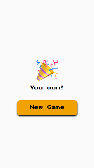
The winning page
The winning page is actually very similar to the home page, except that it will have the winning message instead of the game’s title.
Let’s first build the card component so that we can use it in the game’s grid.
The card component has a back and a front.
The component receives a value to hide, a flipStatus (whether it’s DEFAULT, FLIPPED or MATCHED), and onClick listener to control the click on the card.
The front of the card is by default a question mark to show that the card is hiding something.
Every time we start a game, we should shuffle the positions of our cards. Moreover, every card should have a unique key to identify it in the grid and an emoji value. To do so, we can create a shuffling function in the App component and pass down its resulting cards to the Game route:
// src/components/app.js
import{Component}from"preact";
import{Router}from"preact-router";
importHomefrom"../routes/home";
importGamefrom"../routes/game";
importWinfrom"../routes/win";
/**
* helper function to generate a schuffled array of cards
*/
functiongenerateGridCards(){
const emojis =["🚀","😺","🐶","🏈","📦","🙊"];
return[...emojis,...emojis]
.sort(()=>Math.random()-Math.random())
.map((emoji, idx)=>({key: idx, emoji }));
}
exportdefaultclassAppextendsComponent{
render(){
return(
<divid="app">
<RouteronChange={this.handleRoute}>
<Homepath="/"/>
<Gamepath="/game"cards={generateGridCards()}/>
<Winpath="/win"/>
</Router>
</div>
);
}
}
Note: the schuffling function generateGridCards by creating an array that has two duplications of the emojis array, sorting the array randomly, and then mapping each emoji to a card object containing a unique key (the index) and the emoji value.
We can represent the game’s state in a way that reflects exactly the requirements we discussed in the first section:
state.flippedCards = { first: {}, second: {} } : only 2 cards can be flipped at the same time before deciding whether the player has a match or not. Thus, state.flippedCards contains the currently first and second flipped cards.
state.isMatched = {} : is a map of emojis that were matched. Whenever the player matches a pair of cards, the corresponding emoji is set to true in this object. This helps us determine which cards were watched when rendering.
state.score = 0 : the score of the user, which is 0 initially.
To get a card’s flip status (‘DEFAULT’, ‘FLIPPED’, or ‘MATCHED’), we can do so based on state.flippedCards and state.isMatched objects:
If the card is one of the state.flippedCards, then the card is actually flipped.
If the card’s emoji is in the isMatched map, then the card is matched.
Otherwise, the card is just in its default flip status.
When the player flips a card, the following can be done:
If it’s the first flipped card, then we simply set it in the state.flippedCards
If it’s the second flipped card, then we simply set it in the state.flippedCards and check whether we got a match or not.
In case of a mismatch, we simply flip back the cards by resetting the state.flippedCards to its default value.
In case of a match, we wait 500 ms and then add the emoji of the card to the state.isMatched map (so that the user has enough time to see which cards are flipped before the match). We also increment the score and redirect the player to the winning page in case they reached the maximum score.
When it comes to styling the game’s grid, we have THE perfect case for CSS grid.
/* src/routes/game/style.css */
.game{
position: absolute;
top:0;
bottom:0;
left:0;
right:0;
width:100%;
height:100%;
display: flex;
flex-direction: column;
justify-content: space-between;
align-items: center;
padding-top:15px;
max-height:568px;
}
.score{
text-align: center;
font-size:2rem;
position: relative;
top:30px;
}
.body{
display: flex;
align-items: center;
flex-direction: column;
width:100%;
height:100%;
}
.grid{
display: grid;
grid-template-columns:repeat(3,90px);
grid-template-rows:repeat(4,90px);
grid-gap:10px;
position: absolute;
bottom:10px;
}
And… that’s it! The game should be complete by now! 👻
Game Page
Final touches
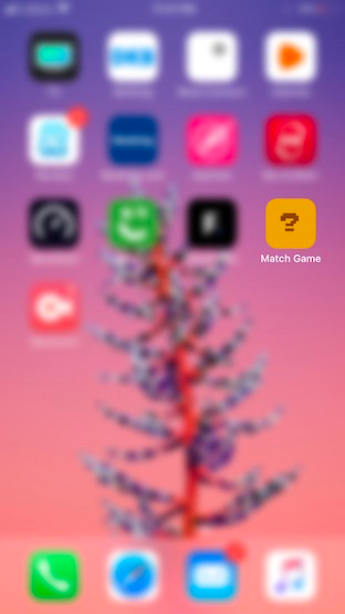
Final icon of the game on iOS
To do so, we first need to generate icons for Android and iOS. To keep things simple, we can choose our Card component to be the icon of the game.
Once we have a screenshot of the Card component, we can use a tool like this to generate the different sizes of icons and place them in the assets/icons directory.
For iOS, we need to add special link tags pointing the apple-touch-icon . In order to achieve that, we can create a template index.html in the src directory that has the required link tags. The following template is basically the default template of preact-cli with our link tags added to it:
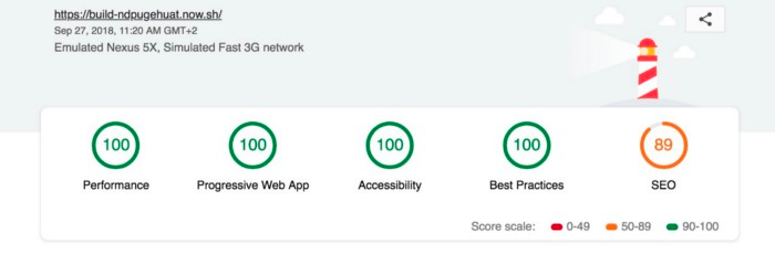
It’s time to evaluate our game based on the requirements we set at the beginning.
To build the game, we can use the build NPM script:
npm run build
The game‘s build result should be available in the /build directory. We can then easily deploy and host the build directory somewhere like ▲now.
Let’s then finally take a look at our game’s functional requirements and PWA checklist and see what we have achieved:
✅ The game’s functional requirements are met.
✅ The game is served over HTTPS: this is supported out of the box by preact-cli.
✅ All pages are responsive on tablets and mobile devices.
✅ The game can be added to the home screen of the user’s device and look like a native app.
✅ Offline Loading: The game can be totally functional offline! Once you add the game to the home screen, you can play it anytime without the need for Internet connection.
✅ Page transitions don’t feel like they block on the network: we literally have instant page transitions
✅ Each page has a URL: this was met by having a route for each page.
I know, drag and drop is a solved problem. There are several great utilities you can use to easily have a drag and drop list in your application (dragula, react-beautiful-dnd, and react-dnd)....