


2025
Strategy
Visual Identity
Motion Identity
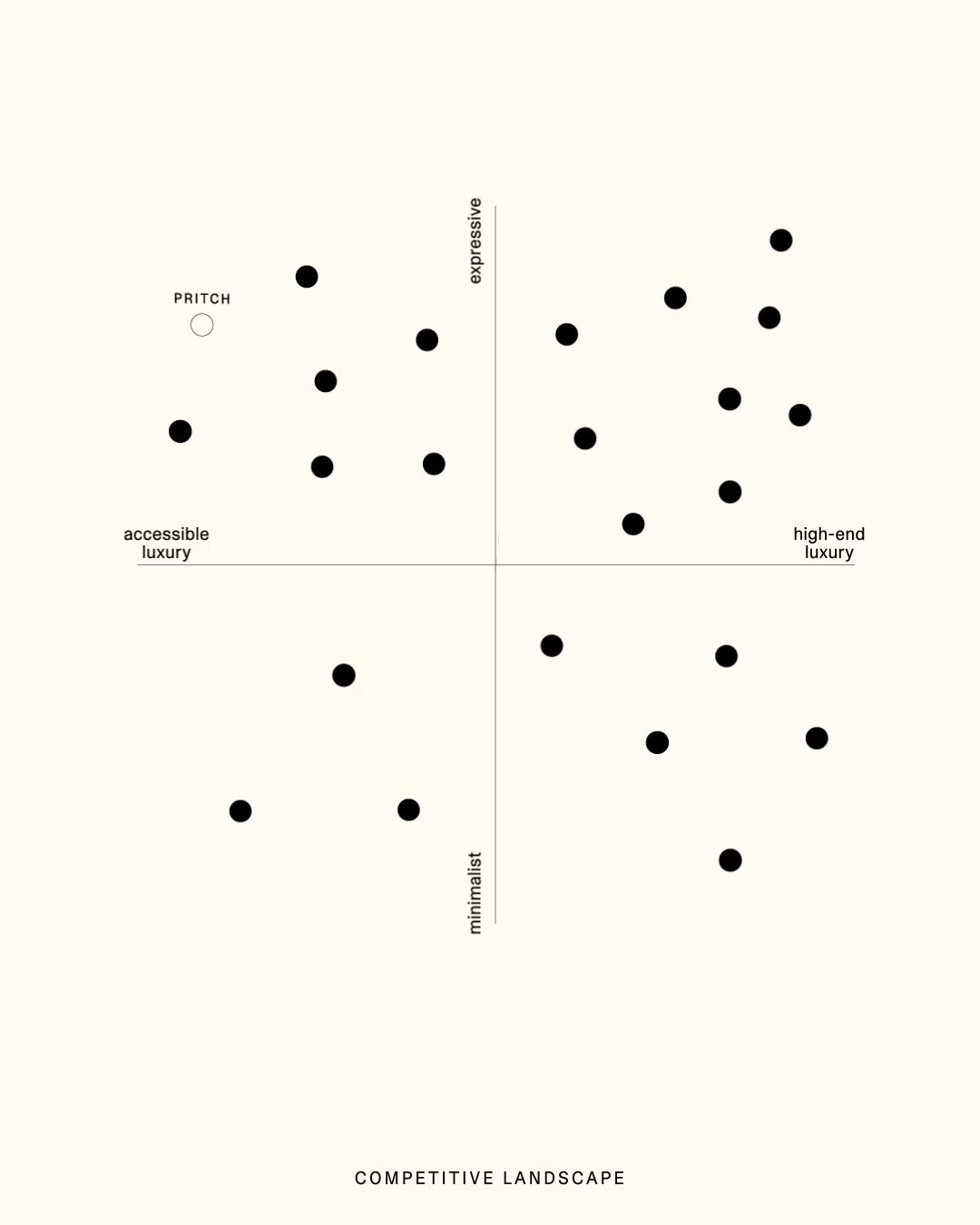
Pritch is a London fashion brand founded in 2012, known for its leather corset belts. After ten years on the market and a lack of clear positioning, the brand decided to relaunch.
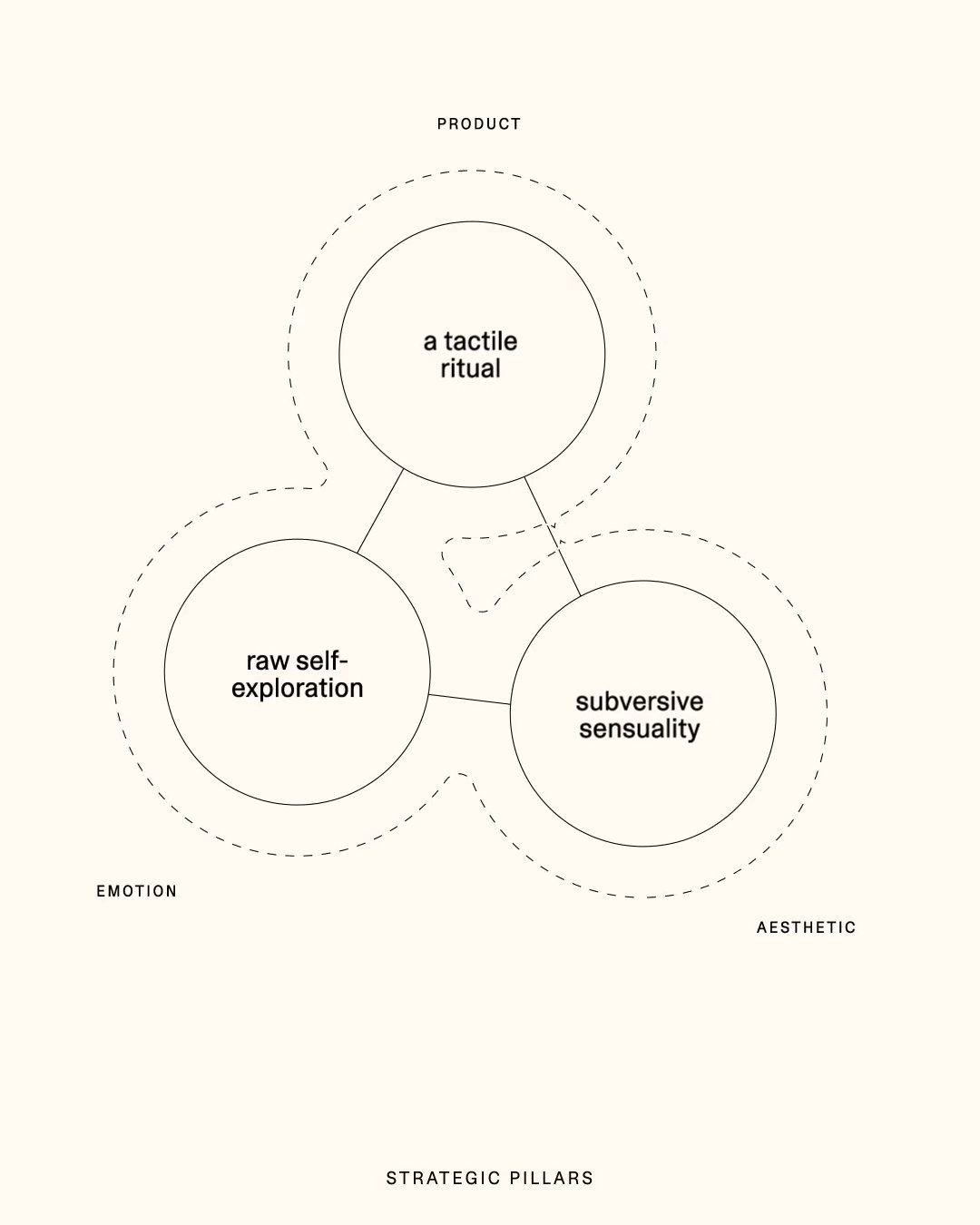
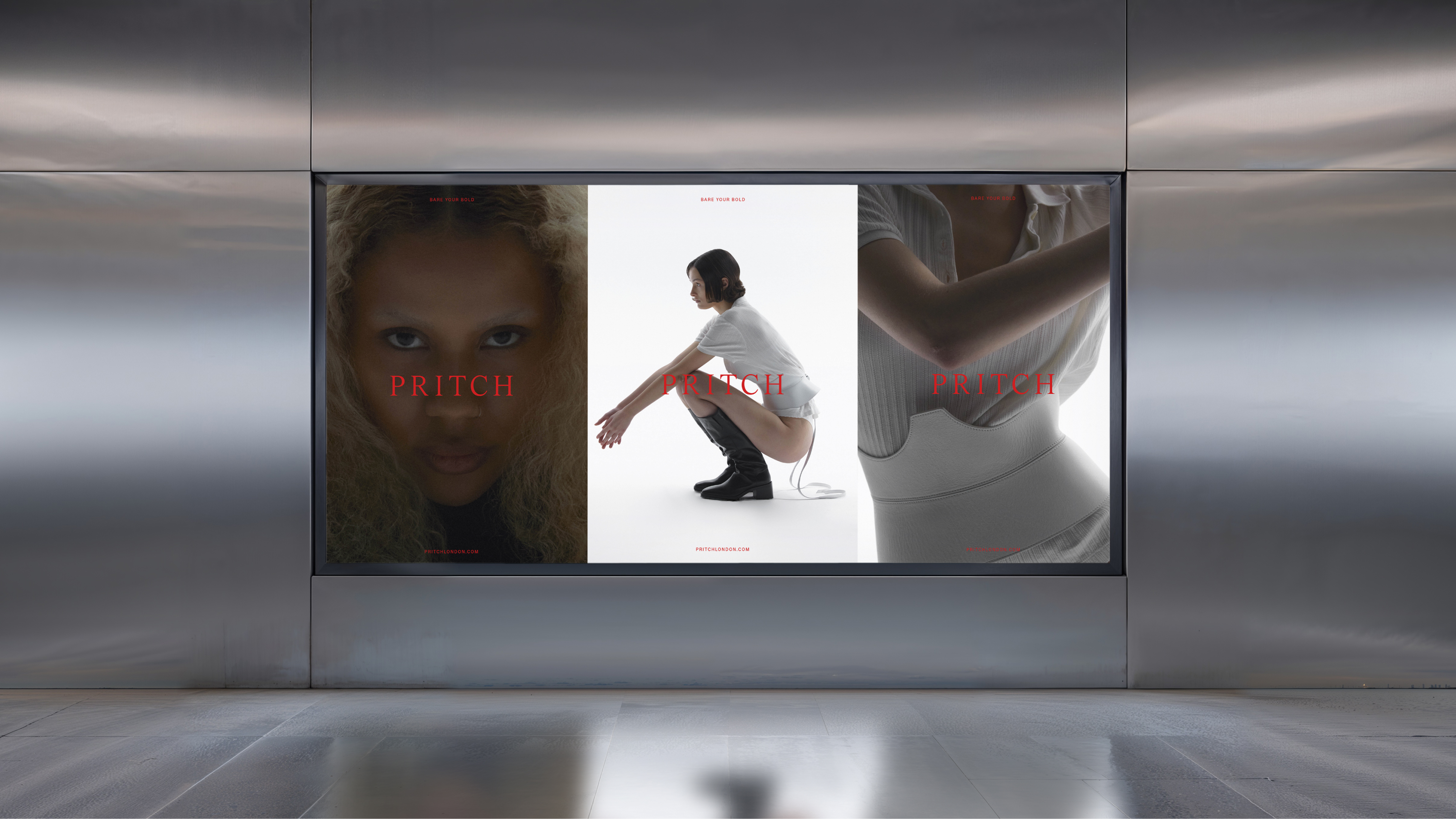
We defined strategic pillars to position Pritch and clarify what comes next. This informed the tone of voice and led to the key insight "Mythology of You" and the manifesto "Bare Your Bold."
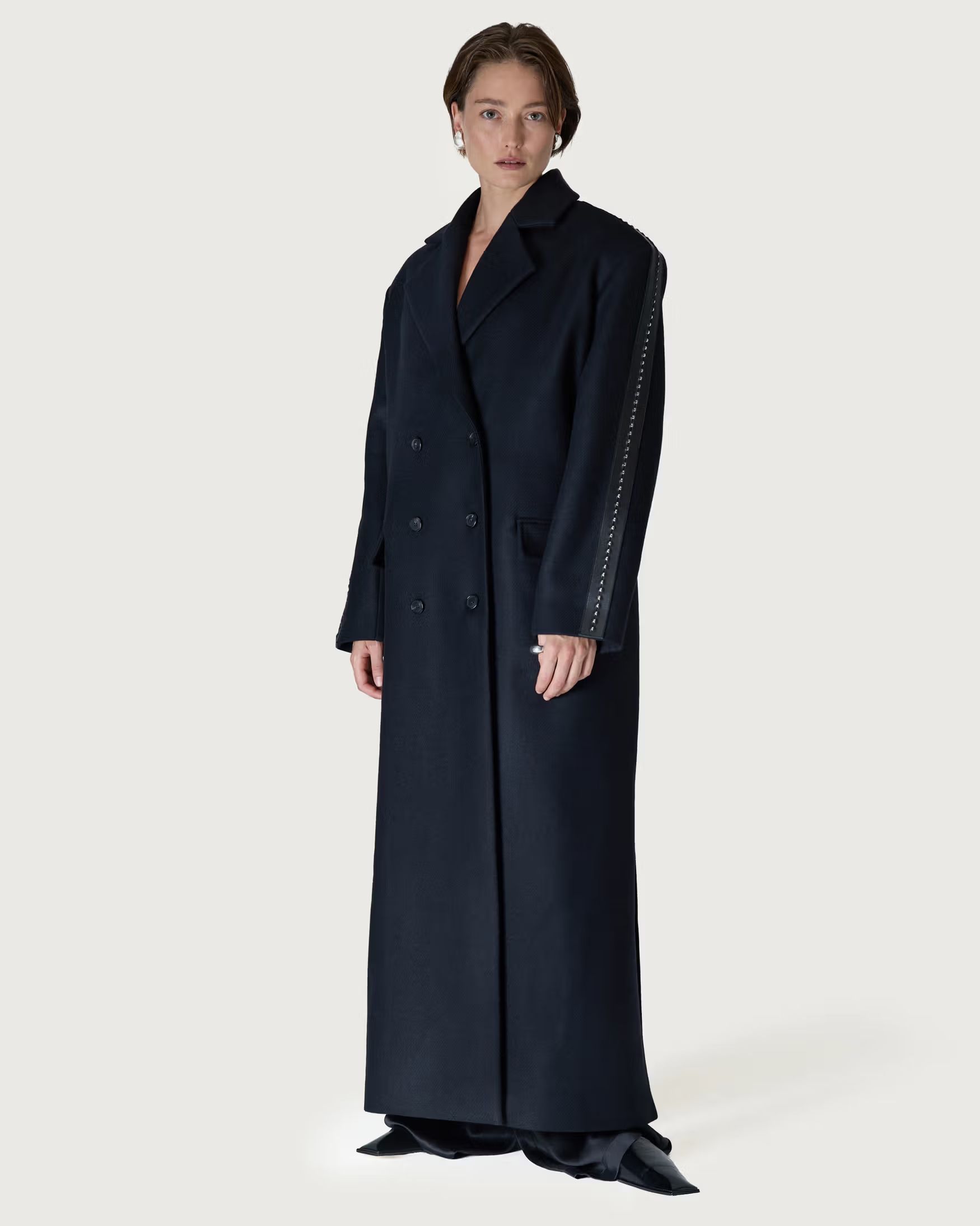
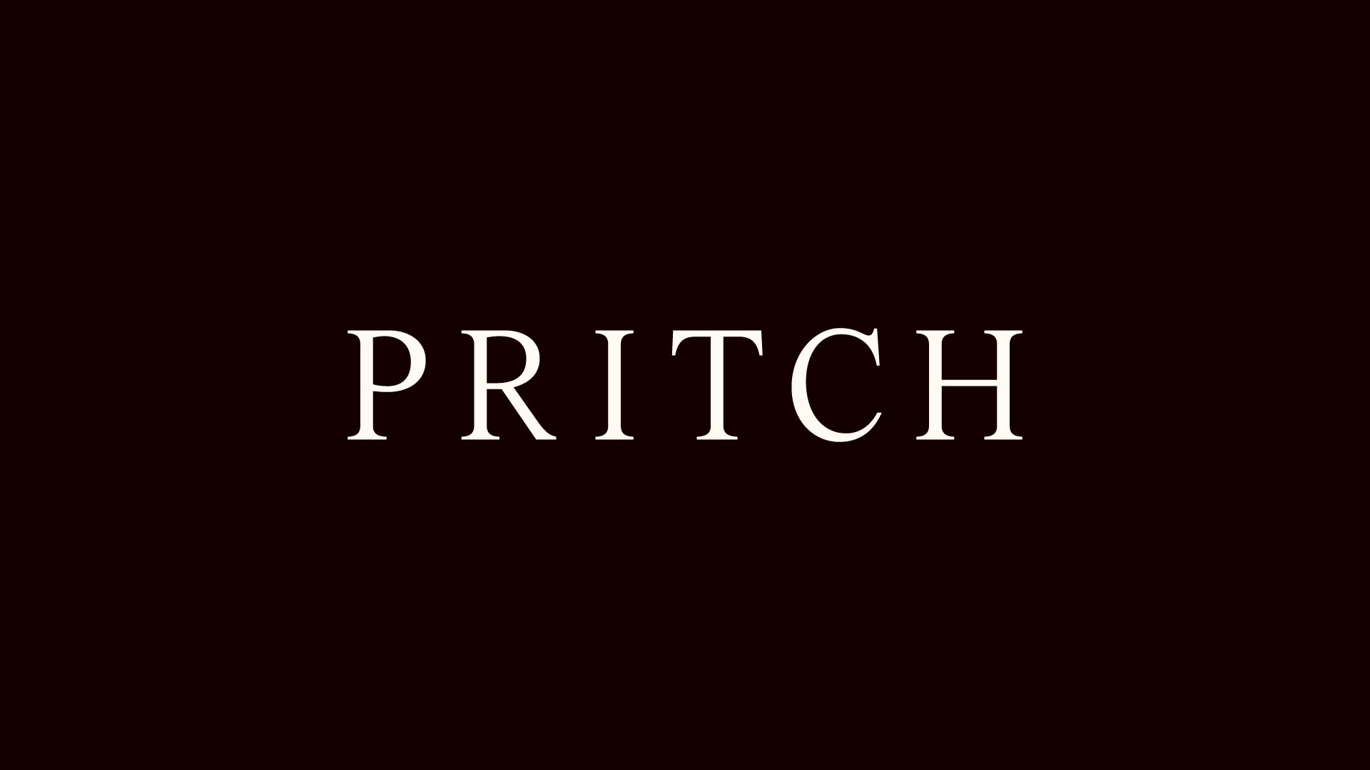
The typographic system was anchored in a transitional serif from Letters from Sweden, balancing confidence with restraint. We paired it with Camera, a condensed neutral sans serif for contrast.
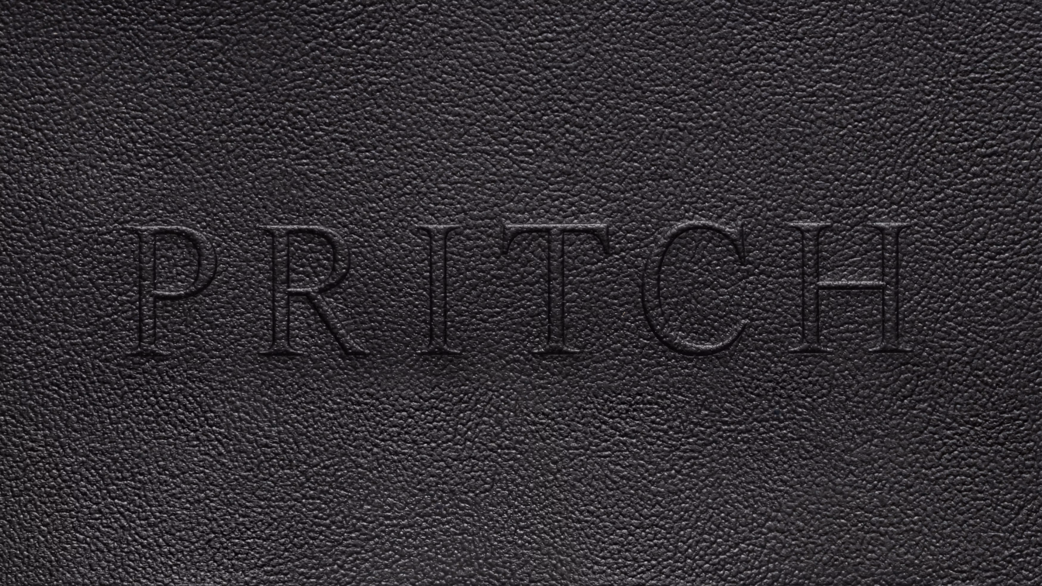
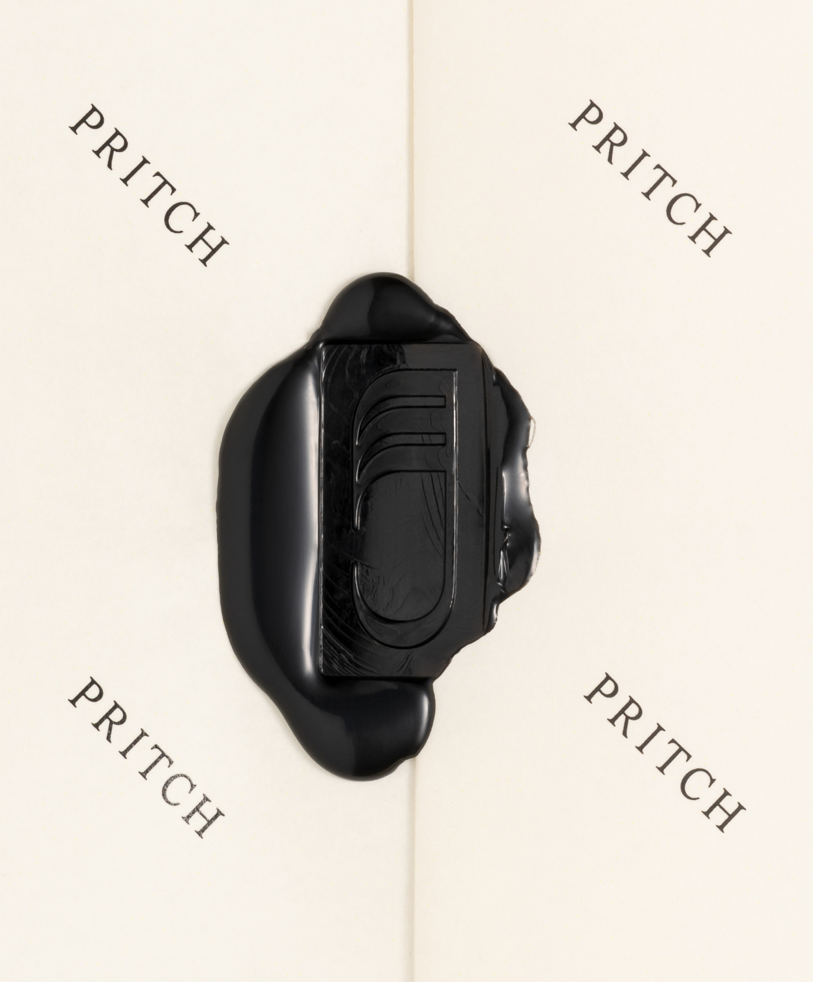
Rather than starting the logo from scratch, we refined the existing logotype using the letter-shapes of the primary typeface. Small adjustments to contrast and spacing brought it into alignment with the wider system.
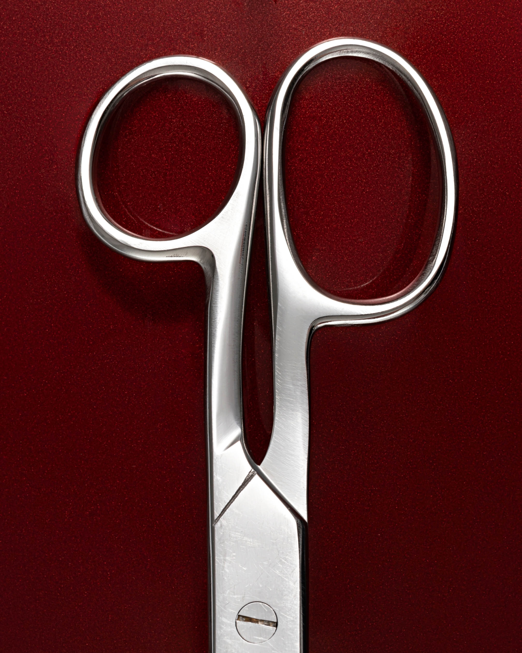
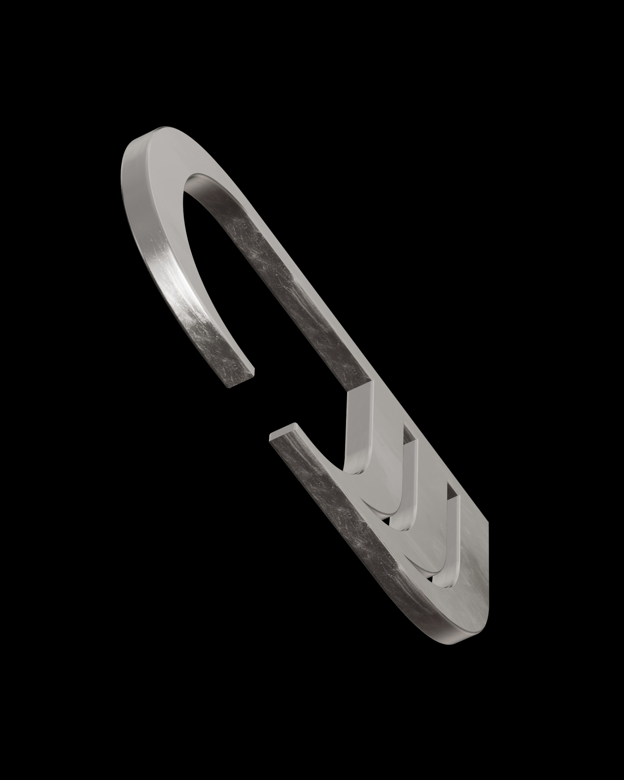
We extended the brand through a single symbolic mark built from the same letter-shapes and informed by the earlier raven motif. Focused solely on the claw, it became more restrained and open to interpretation.
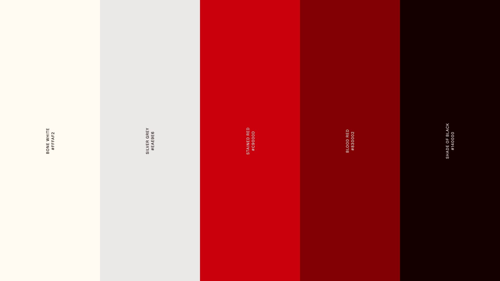
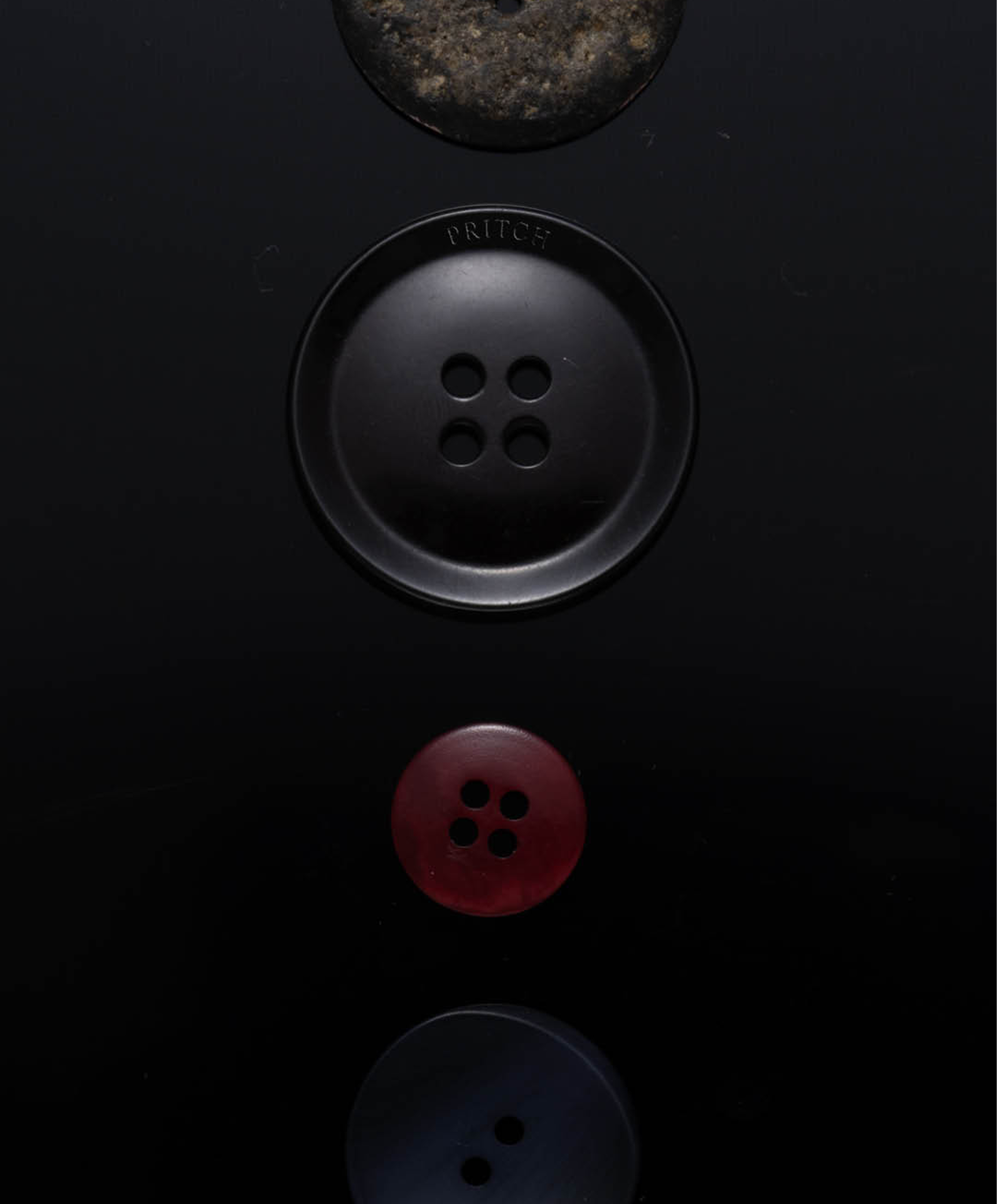
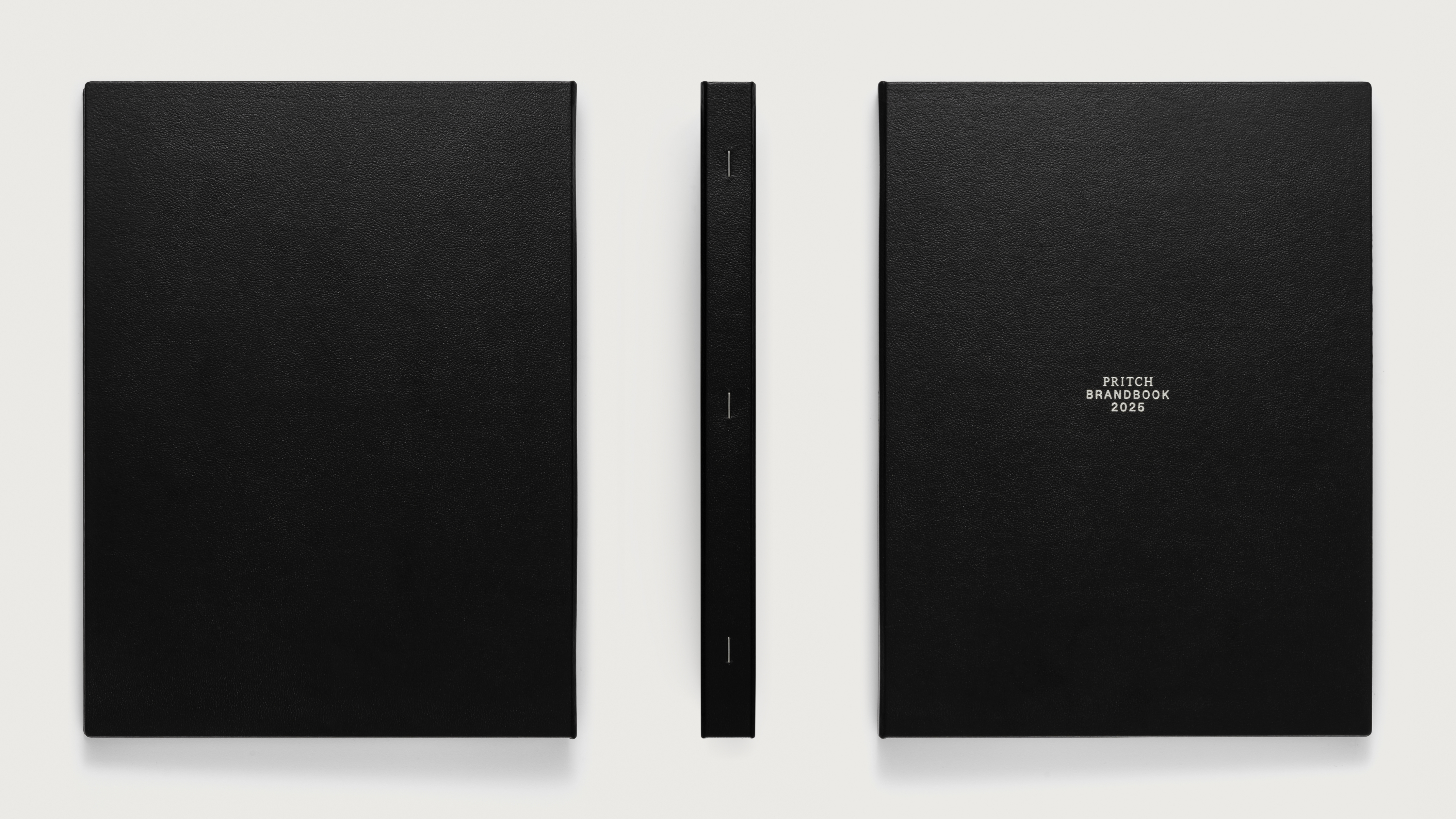
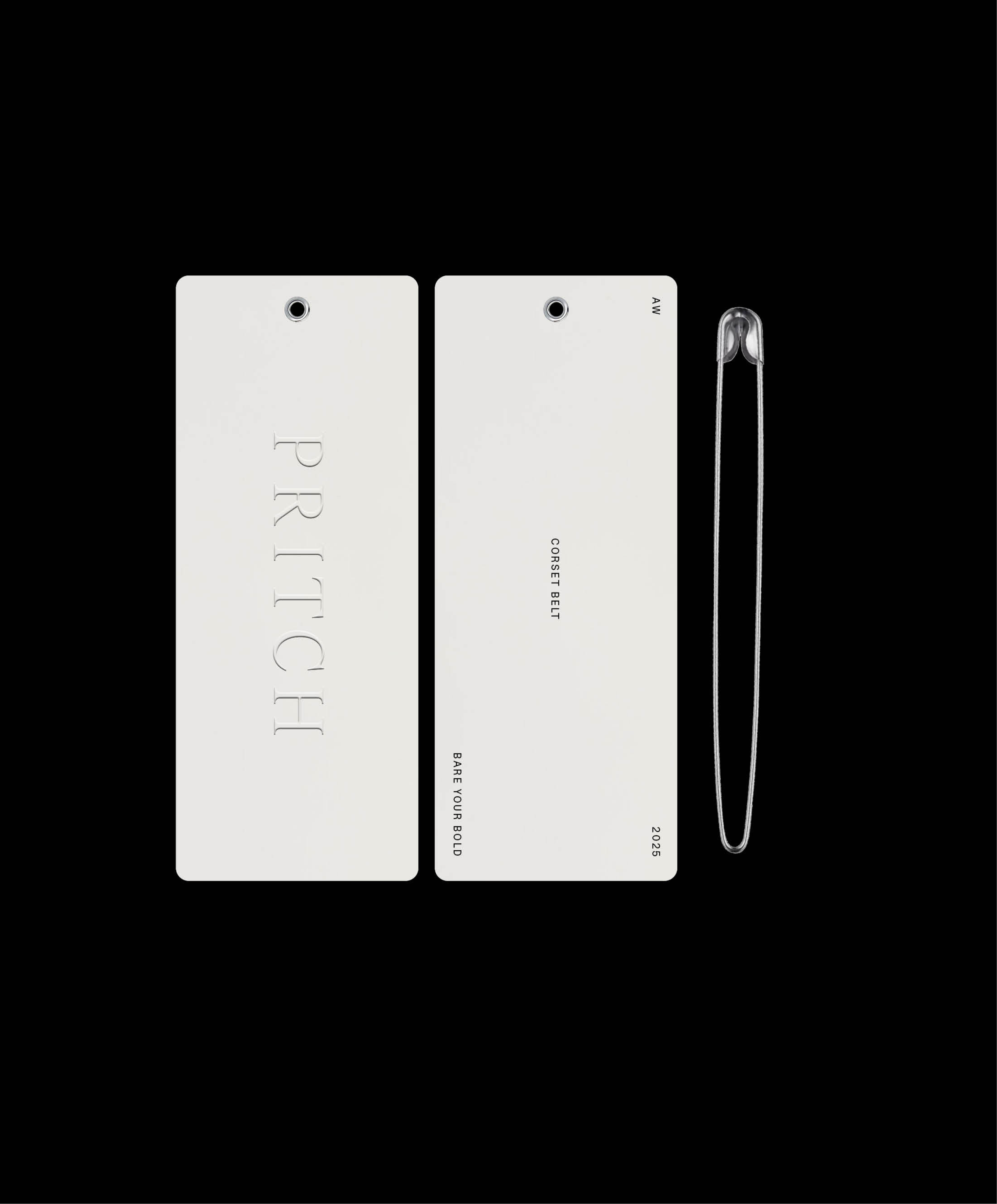
The palette stayed largely neutral, with a restrained pop of red. We also explored multi-sensory touchpoints: logo embossing, a physical brand book, and scent development. This work became the foundation for the website and social strategy.
Sadly, Pritch ceased operations shortly before the go-live.
Fred Heinsohn, Martin Taylor
Fred Heinsohn, Anikó Legner
Fred Heinsohn, Viktor Horváth
Fred Heinsohn, Sam Williams, Martin Taylor, Viktor Horváth, Markus Sasse
Pritch
Europrint Medien
Buchbinderei Künder
The content of this page reflects the state of the project during Tinloof's engagement.